
Overview

Redesigning IRCTC Rail Connect to refine the train booking journey and resolve usability issues

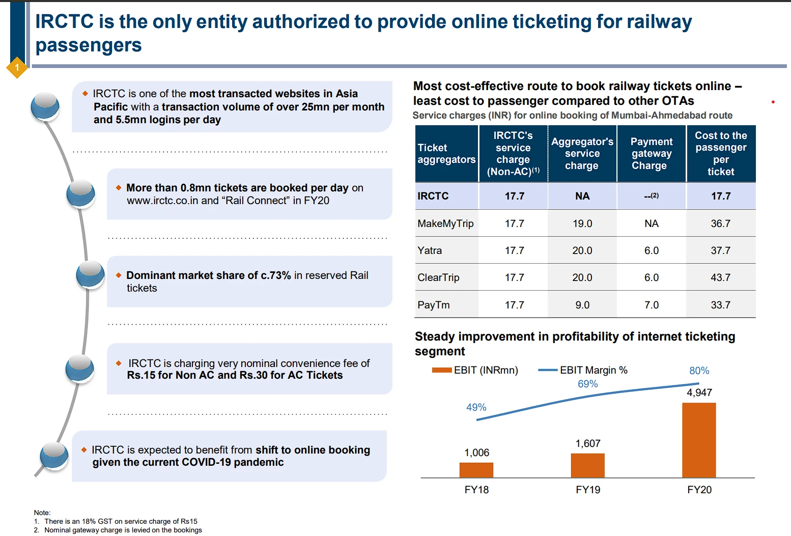
The Indian Railway Catering and Tourism Corporation's (IRCTC) Rail Connect mobile app is the preferred method for purchasing train tickets in India. It is one of the most transacted websites in Asia - Pacific with a transaction volume of over 25 million per month and 5.5 mn logins per day. On an average 12.38 lakhs tickets were sold daily through IRCTC's website and mobile app during FY 2023-24

But despite all of its features, a lot of customers choose to use third-party apps instead of the official app because they don't like the poor user experience. Realising this, I made the decision to address these issues with a redesign that would improve usability and the user experience in general. My objective was to design an interface that would satisfy the needs of contemporary users by being more smooth and intuitive.

UX.UI designerRole
User experience, usabilityFocus

Research

The Starting Point - Putting Users at the
center my work

To gain a comprehensive understanding and gather valuable insights about the IRCTC Mobile App, I conducted user research. I started by reaching out to friends, relatives, and professors who regularly travel by train to share their experiences with the app. Additionally, I sought feedback from my father, who, through his work in the Railway Protection Force (RPF), has a deep connection with the railways, offering unique insights into the app's functionality.

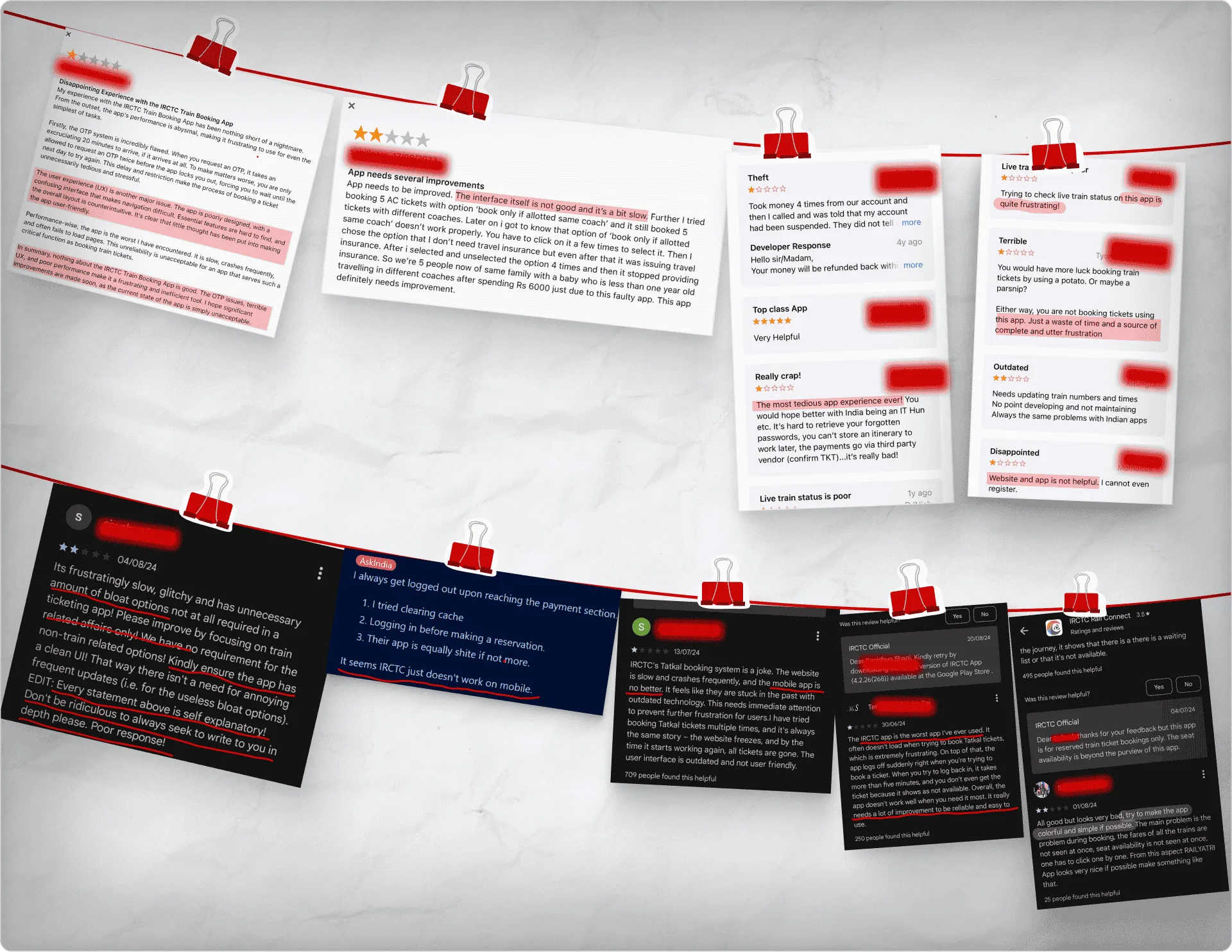
However, to broaden my perspective, I placed significant emphasis on analyzing user reviews from Google Play and the Apple App Store. These reviews provided a wealth of feedback directly from the app's users, highlighting common pain points, suggestions for improvements, and general sentiment. The insights gathered from these reviews were invaluable in understanding the real-world challenges users face when interacting with the app.

Among the most common pain locations
are:

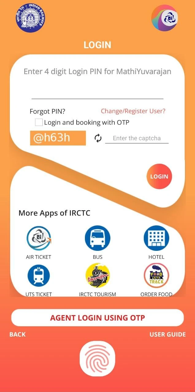
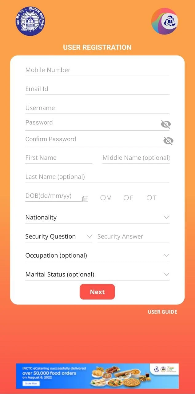
The login and signup pages are among the most crucial aspects of any app, including the IRCTC Mobile App. These pages are the first point of interaction for many users and set the tone for their overall experience with the app. A poor login and signup process can significantly impact user retention and satisfaction.

Clutter & no hierarchy

A cluttered design, combined with the inconvenience of CAPTCHAs.

Complicated login process

User frustration is increased by the call-to-action buttons' ineffectiveness and the design layout's poor organisation.

Insufficient negative space, especially in confined spaces, can cause eye stress and cognitive strain.

Congested Spacing

The crowded spacing in the app's interface makes it challenging for users to effectively navigate and interact with elements.

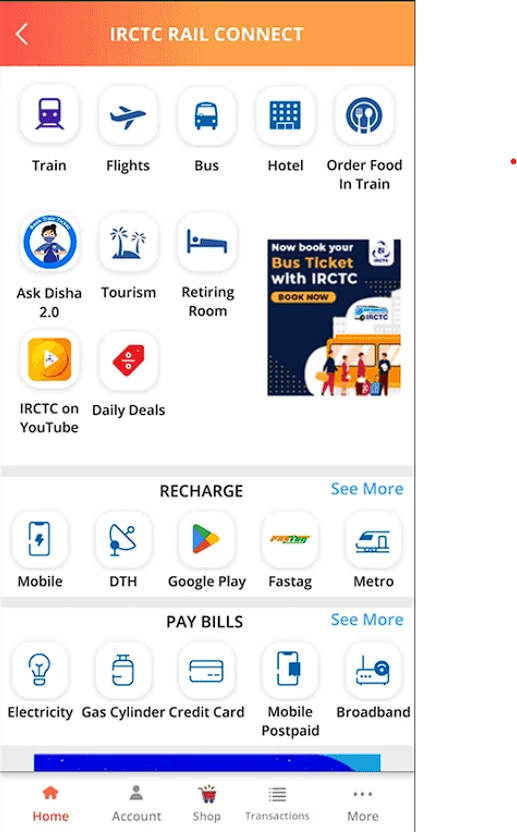
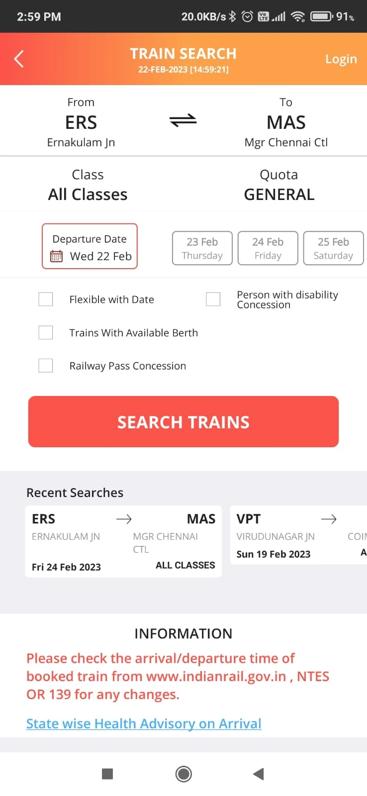
Confusing reservation procedure

Difficult to locate main features
because of unintuitive structure

Recall over recognition

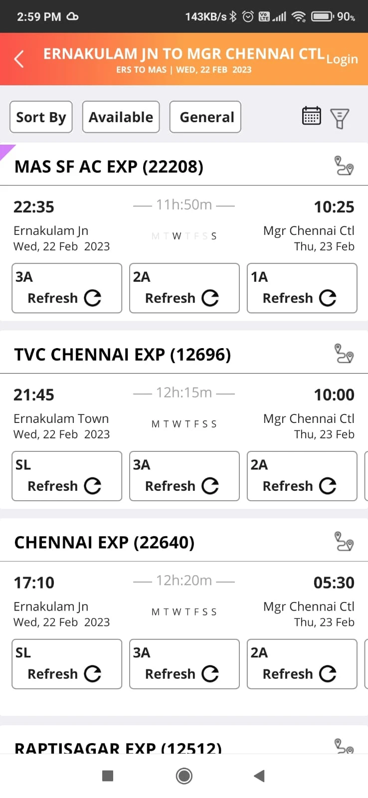
The calendar in the existing app allows users to select a date, but it feels stiff and confusing. In order to change their selected date, users must navigate back to the previous screen, which adds extra steps and disrupts the booking process.

Unsorted

The overall feel of the app looks
unorganised.

Key takeaways

Inconsistent Navigation

Users face challenges as a result of irregular screen layouts and nonstandard navigation elements.

Overwhelming Information
Density

The application presents an excessive amount of information at once, which confuses users and makes it difficult for them to locate pertinent details.

Edit Passenger Info

Editing passenger information is not possible from the "Review and Pay" screen.

Recognition Difficulties

Rather than making it simple for users to recognise and modify their previous selections, the current design makes them recall them.

Define

29, India
IT Manager

Gautam

Gautam is a busy IT professional who travels a lot, both for business and pleasure.
He appreciates apps that provide a smooth user experience and expedite the
booking process because he has a busy schedule.

Motivations

  • Convenience
  • Simplicity
  • Efficiency
  • Budget friendly

Goals

  • Travel to different cities and meet different people from different states.
  • Wants to book tickets without and difficulty
  • Easily view and manage travel itinararies

Frustrations

  • Gets easily frustrated if the interface is difficult to use and looks messy
  • Use the IRCTC app mostly even though thinks that the app is super confusing but use it anyway because its the official app.
  • Gets frustrated if someone wants him to book a ticket
Design

Clear, Sharp & Minimal

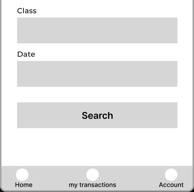
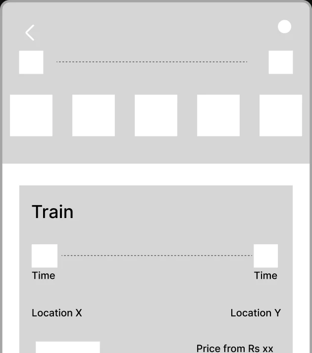
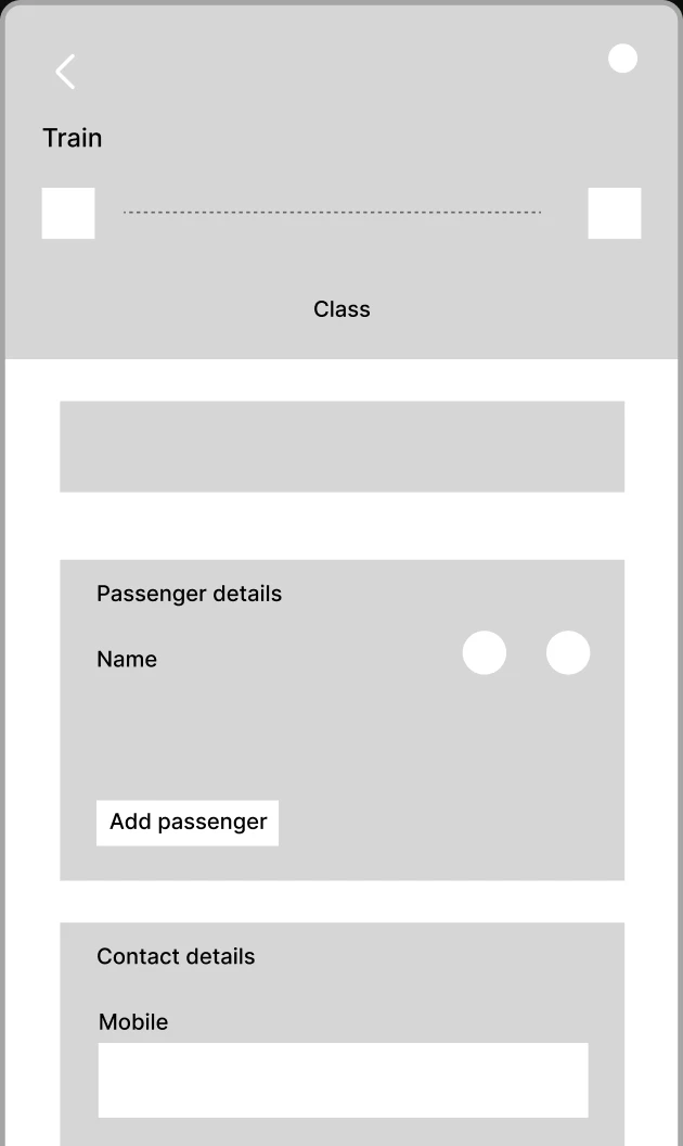
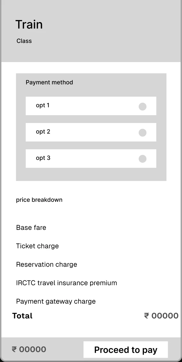
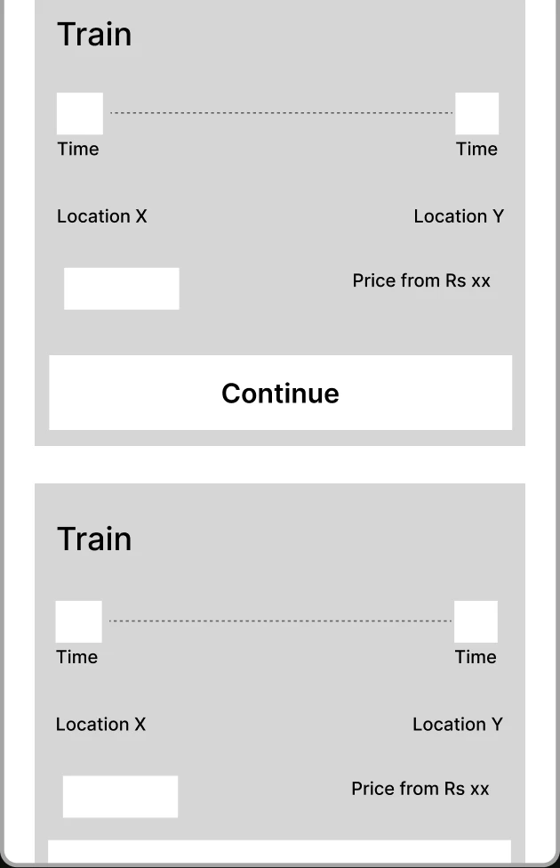
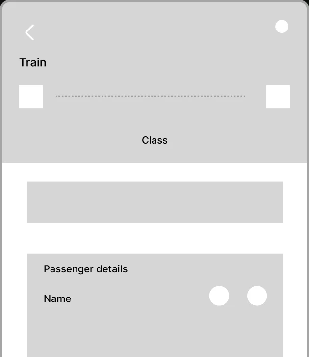
I made these low-fidelity wireframes, which are layout and functionality-focused,
serve as a visual manual that lays out the key components and user flow of the app.

Final UI

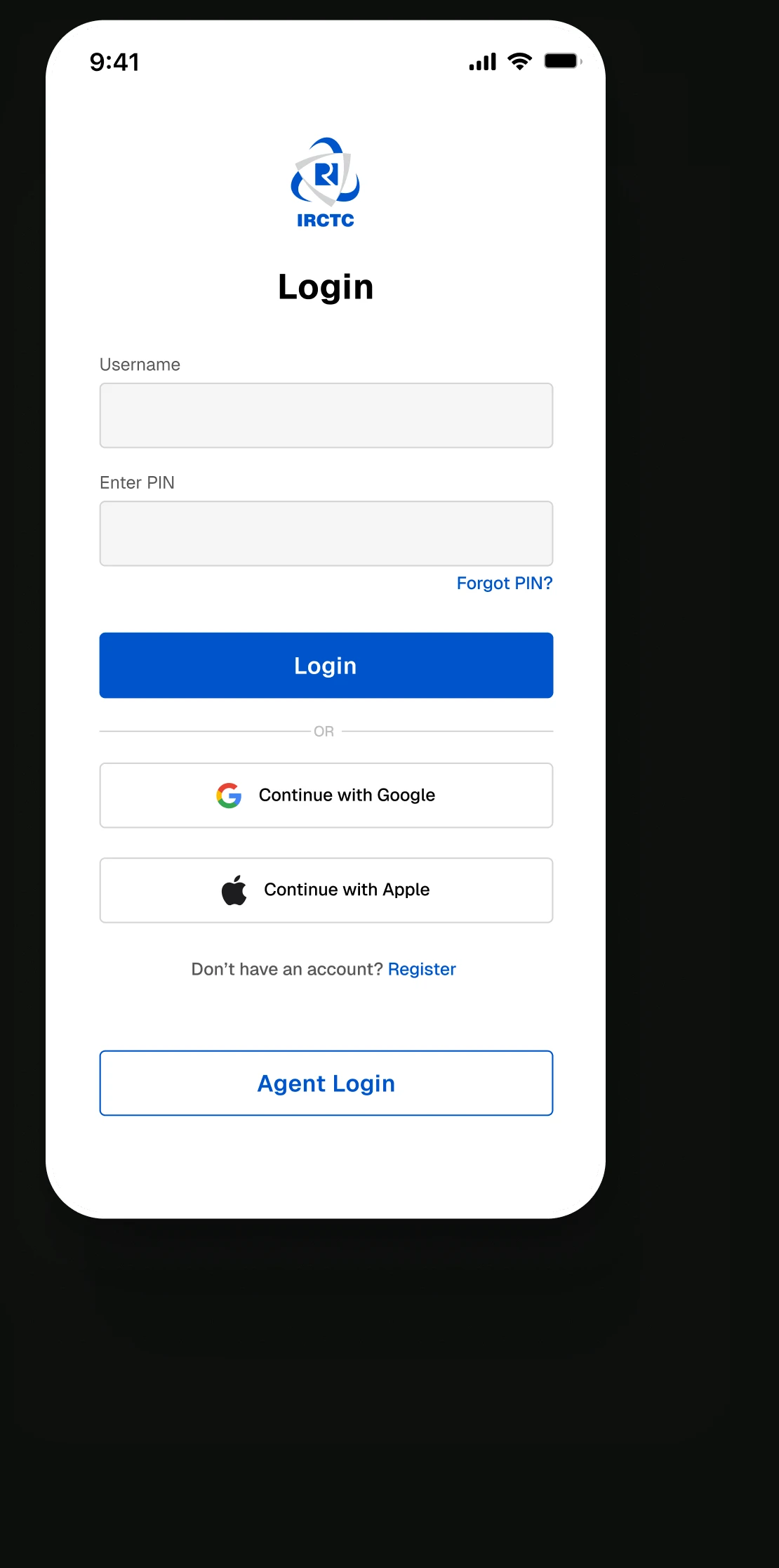
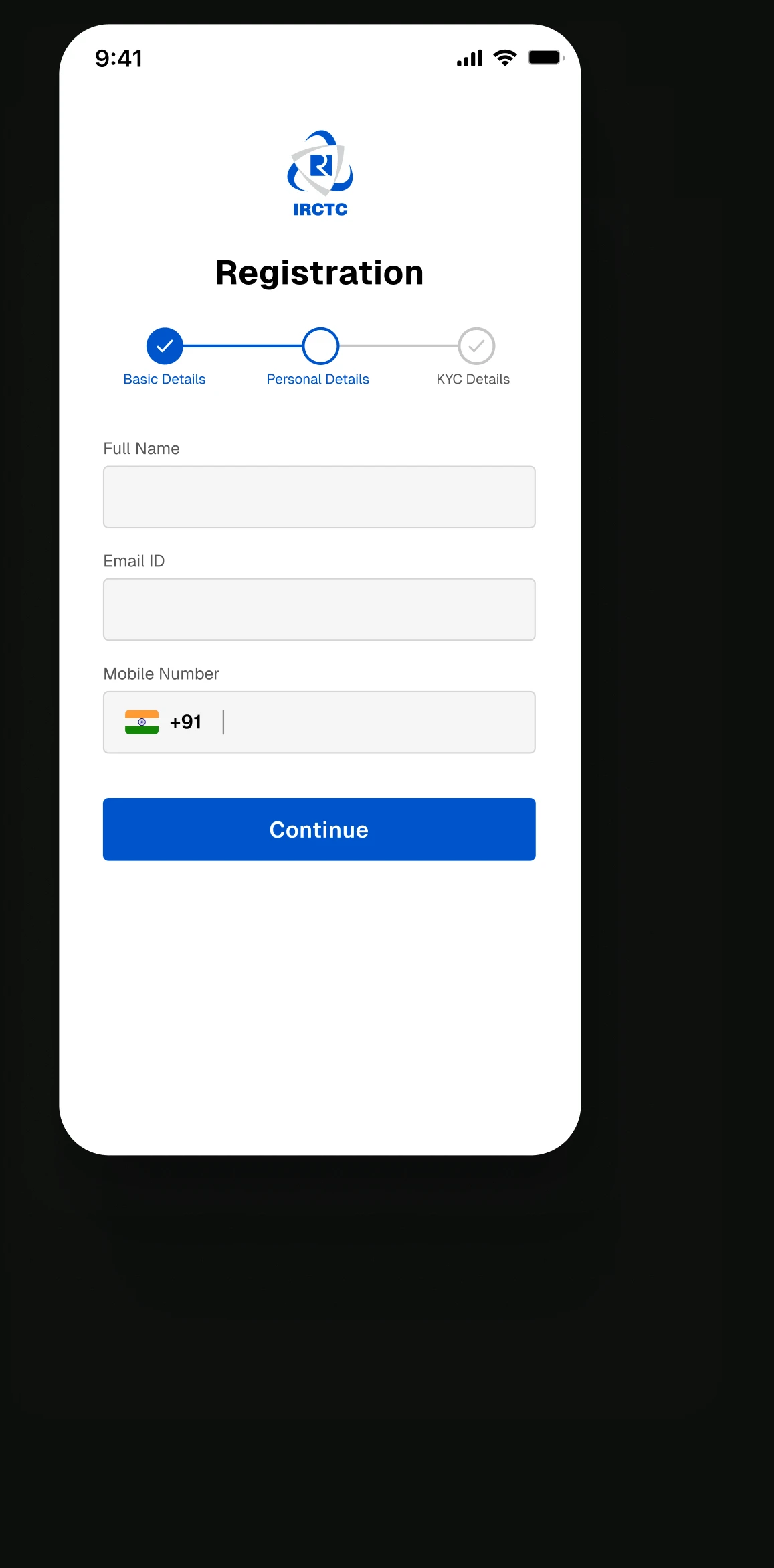
A simple login screen without any visual clutter and the inconvenience of captcha's

Easily located CTA's

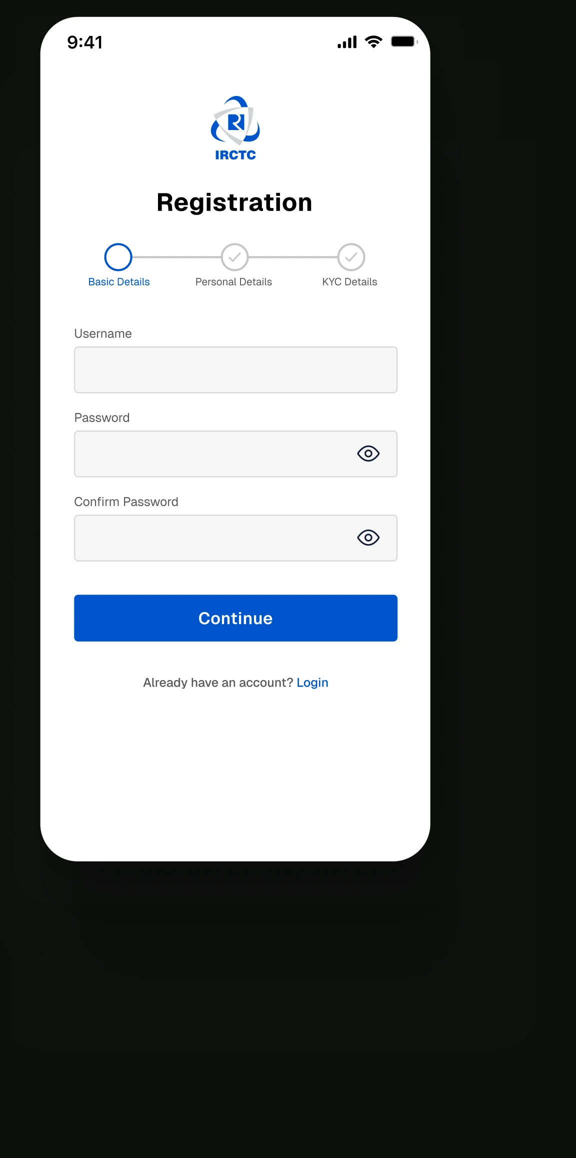
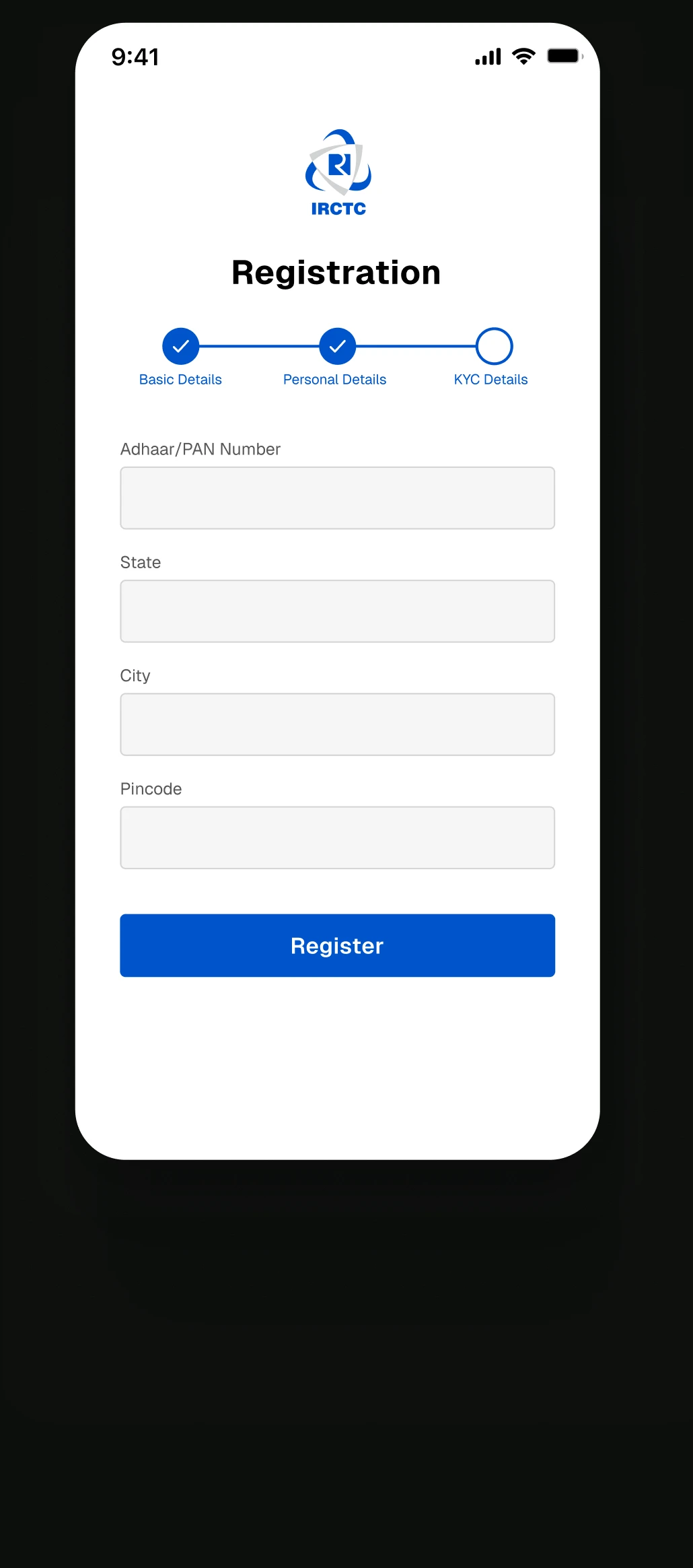
Simplified the signup process by adding a progress bar to show completion status.

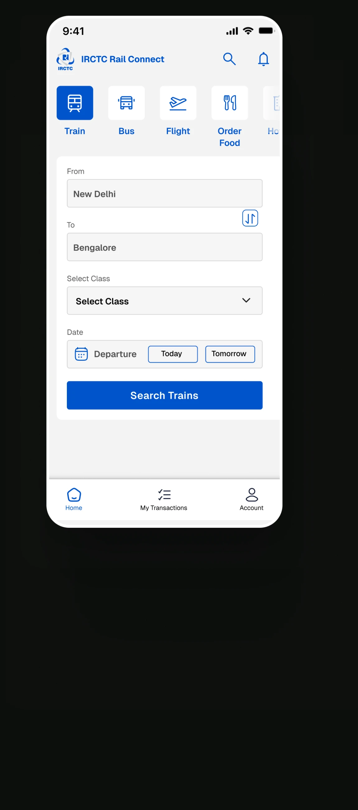
Notification: for every update and search: to allows users to search any service they want.

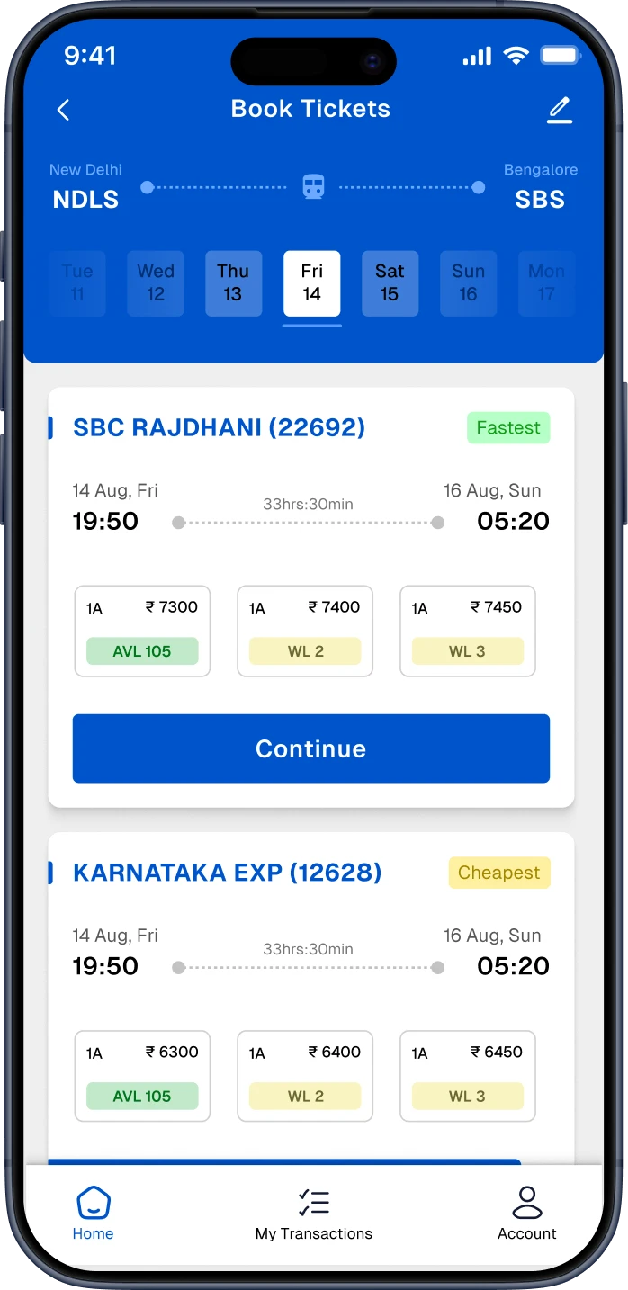
Provided the option to search for trains and select date and departure right on the home screen

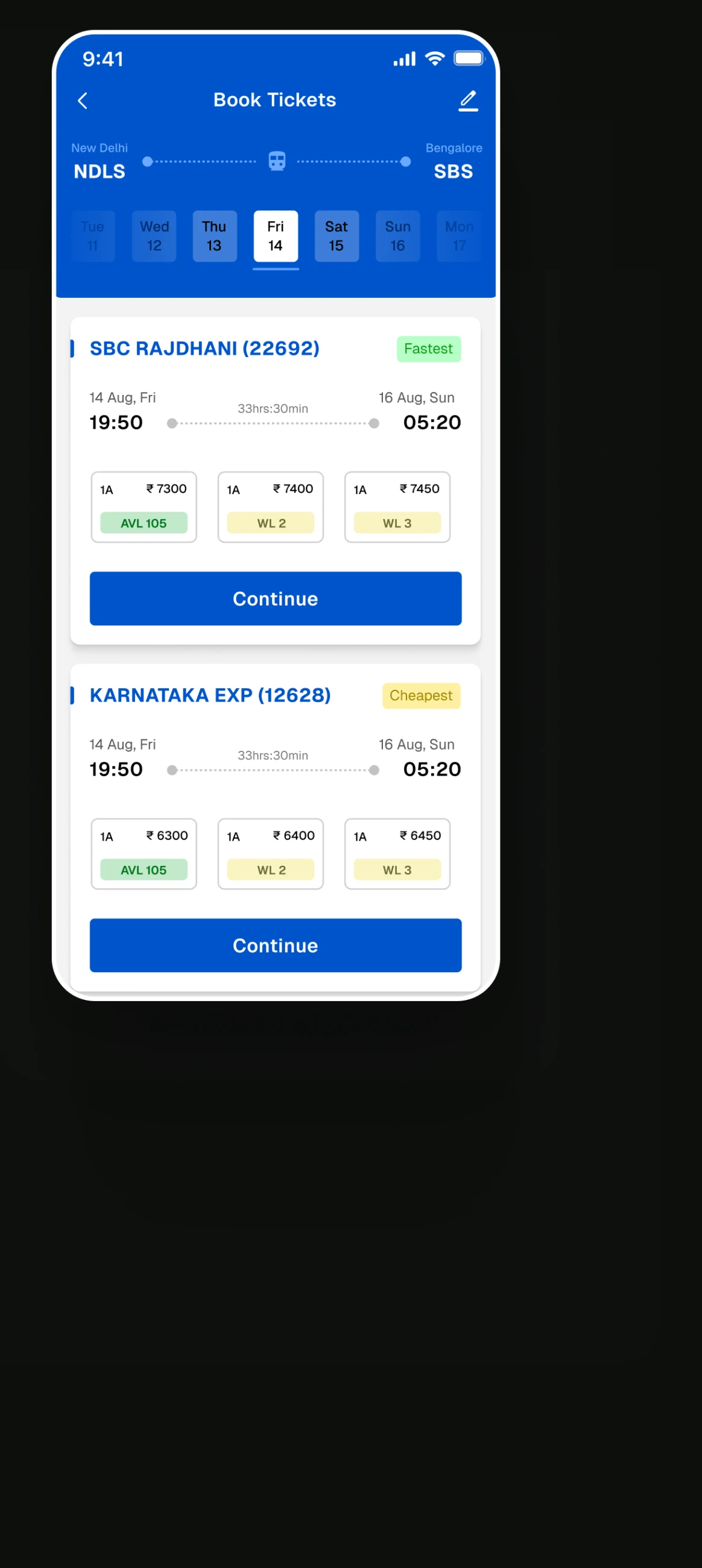
Date sliders provide a clear and intuitive visual representation of the timeline, making it easier for users to understand the range and context of dates they are selecting.

I provided ample spacing for the content to prevent it from feeling cluttered.

The addition of tags ( fasterst, cheapest etc) allows users to make a guided decision.

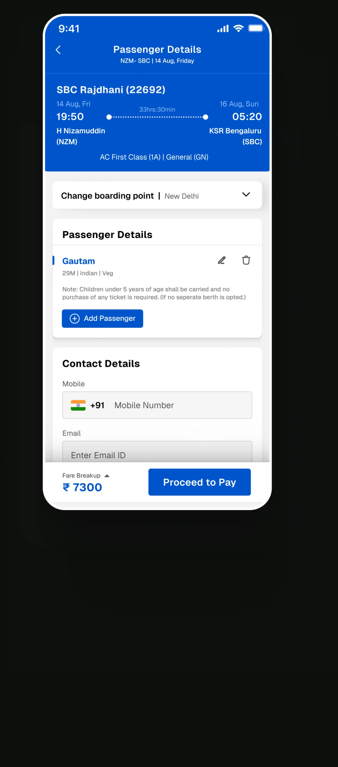
Easy to understand input field to change the boarding station

Users can easily Add, Delete and Edit passengers details

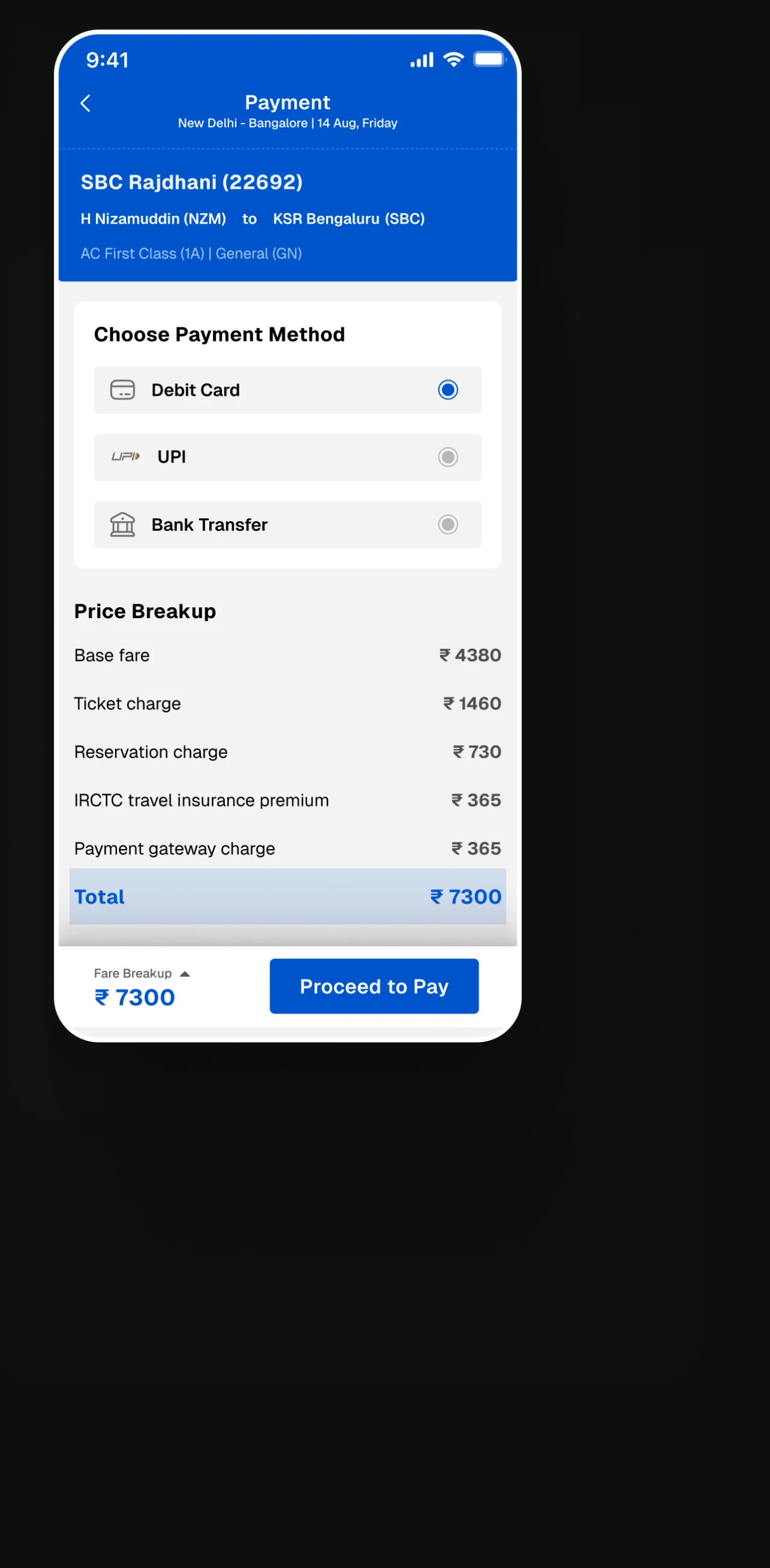
Easily select payment method by just switching to different modes.

Emphasis is placed on the total amount due in order to make the fare clear.

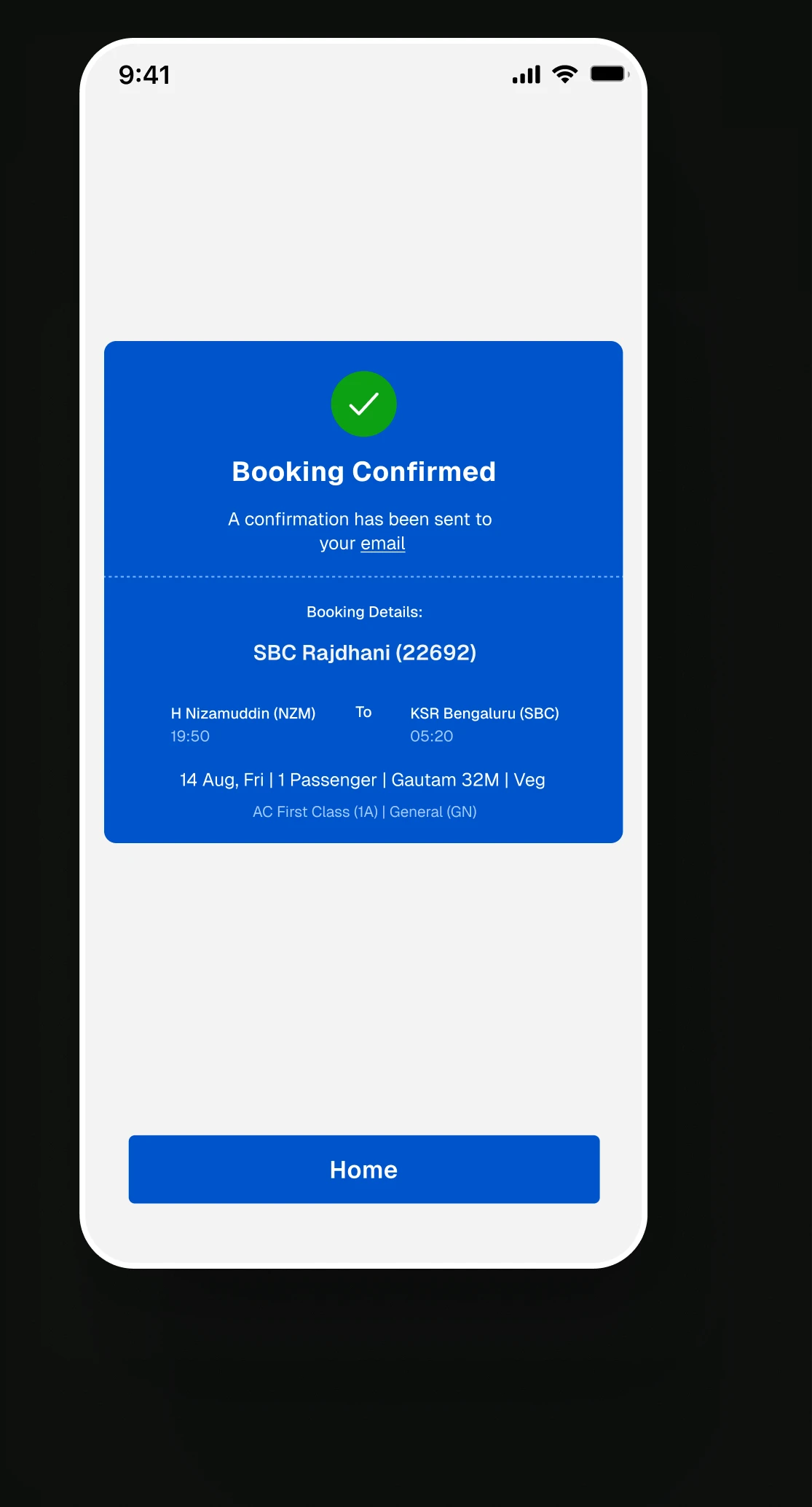
Clear confirmation message

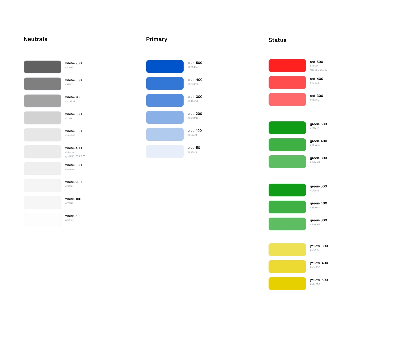
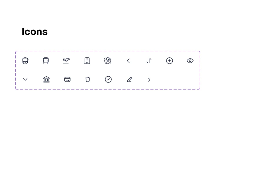
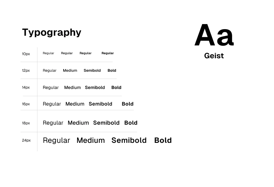
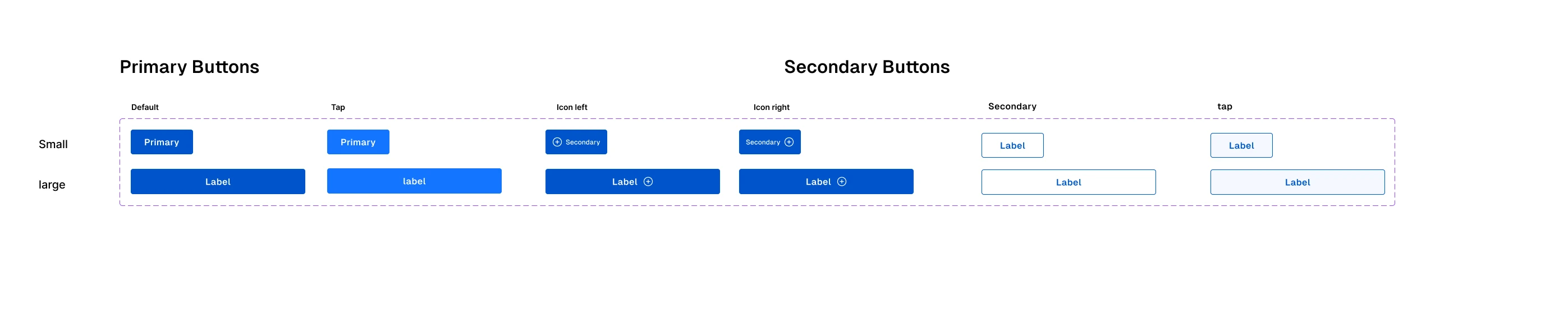
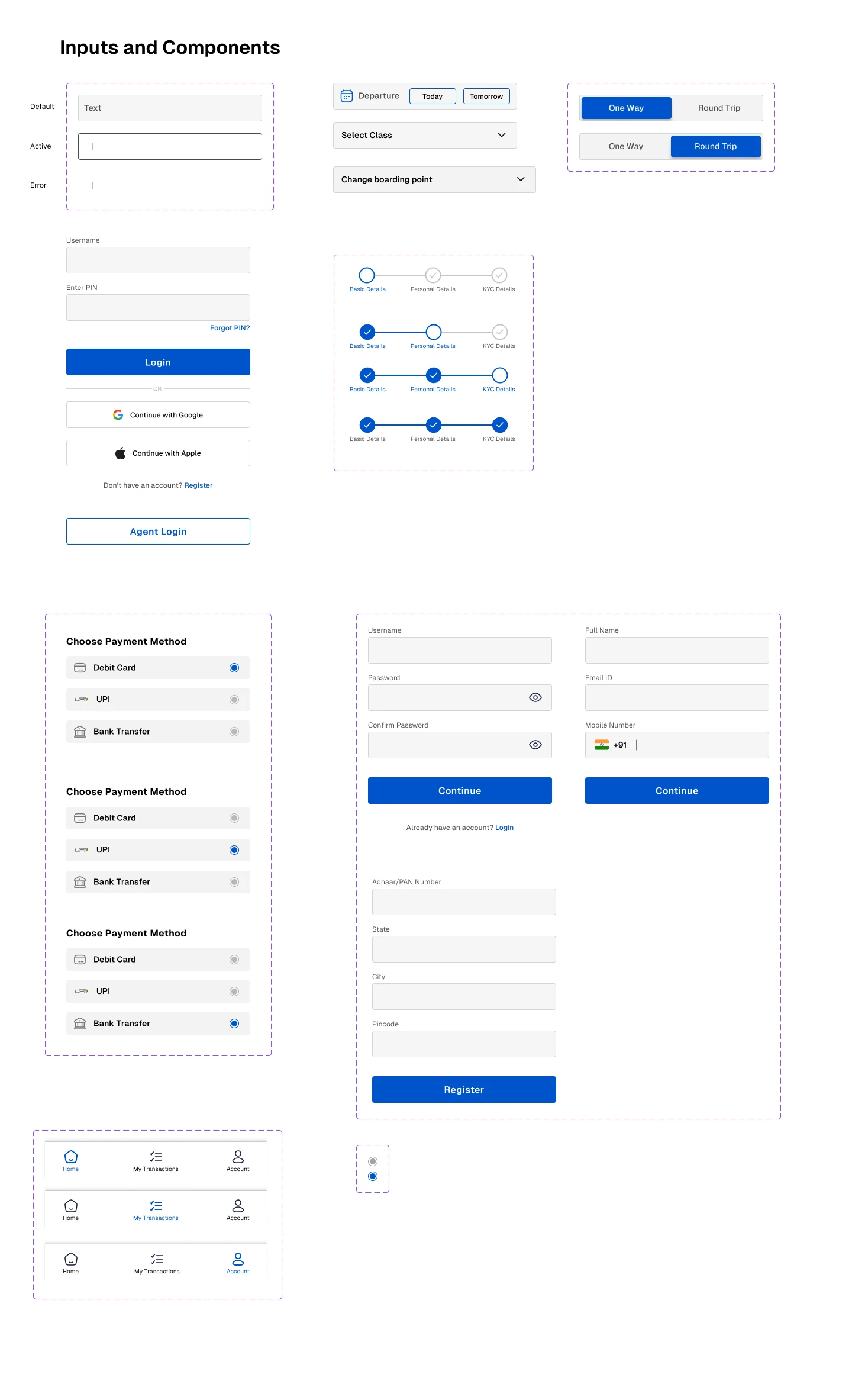
Design system

Key takeaway

This redesign helped me understand how small usability issues can have a significant impact on the overall experience. By combining user feedback, app reviews, and my own exploration, I learned to look beyond visual improvements and focus on making the experience clearer, simpler, and more intuitive for users.

More than redesigning an interface, this project taught me to question existing design decisions and approach problems from the user's perspective.